
Look, the moment September hits, the calendar starts flipping pages faster than a thriller novel, right? Suddenly, the air is crisp, the coffee needs a sweater, and you realize your home still looks like it’s waiting for a pool party. We all want that perfect, warm, cozy feeling when autumn rolls around—that moment when you walk through the door and the whole space just sighs contentedly.
But let’s be real: sometimes we try to nail that quintessential autumn look, and it just… falls flat. Maybe it ends up looking too cluttered, too theme-park-ish, or frankly, too reliant on things you bought in a bin five years ago. I’ve been there. I’ve owned the bright orange plastic wreath that faded in the sun by mid-October.
If you’re looking to create fall decor that feels rich, collected, and genuinely inviting—not just seasonally obligated—you’ve come to the right place. The trick isn’t buying more stuff; it’s choosing the right textures, lights, and natural elements that give your home that deep, comfortable Hygge ambiance.
Key Takeaways
- Skip the bright plastics and focus on deep, layered textures like burlap runners and knit wool for instant warmth.
- Ditch primary orange in favor of muted tones—think deep burgundies, sage greens, and sophisticated metallic copper accents.
- Create a cozy glow using multiple sources of warm light, paying special attention to LED flicker candles for maximum atmosphere.
- Stop buying identical orange gourds and start incorporating diverse, naturally textured Heirloom pumpkins for authentic seasonal appeal.
Focusing on Texture: The Secret Ingredient of Autumn Coziness

Image credit: www.countryliving.com
When you think about feeling cozy, what happens? You probably picture yourself wrapped up in a blanket, maybe petting a soft dog, or drinking something warm. That’s because coziness is deeply sensory, and in interior design, that translates directly to texture.
If your fall decor consists mainly of smooth glass, glossy ceramics, or thin cotton, you’re missing out on a huge opportunity to signal “warmth.” Texture is the easiest way to give your room visual weight and depth, making the space feel instantly heavier and richer—perfect for when the temperatures drop outside.
I always start with the table and the mantelpiece. Swap out your usual table runner for something substantial. I absolutely love a thick, natural fiber like a burlap runner. The slight scratch, the uneven weave—it grounds the entire setting and gives everything else you place on it (like those beautiful ceramic gourds or a stack of worn books) a sense of permanence.
Don’t forget the vertical space. Tucking simple elements like tall, dried wheat sheaves into vases or urns adds a wonderful spiky contrast to soft knit throws. You can literally feel the difference in the room just by looking at these layered materials.
- Swap light linen throws for chunky cable-knit wool or deep velvet pillows.
- Use natural wood bowls and stone chargers instead of bright plastic containers.
- Introduce dried materials like cotton bolls or moss balls, which have a lovely, muted softness.
The Color Palette Switch: Moving Beyond Primary Orange
Image credit: www.greenleafblueberry.com
Honestly, the biggest mistake I see people make with their fall decor is relying too heavily on the obvious, primary-color orange that screams “Halloween aisle.” While we certainly want those warm colors, sophisticated autumn style uses color the way nature does: muted, deep, and complex.
Think about the colors of wine, dried spices, or the shadows in the late afternoon sun. We’re moving toward deep burgundies, oxidized sage greens, mustards that lean toward ochre, and rich, chocolatey browns. These colors are far more grounding than a traffic-cone orange.
When you’re trying to add a little sparkle without resorting to tinsel, I suggest going for metallic copper accents. Copper has that perfect warm glow; it reflects light beautifully but feels less flashy than silver or polished brass. A few simple copper mugs hanging on a rack or a hammered copper bowl sitting on a shelf can add tremendous depth to your scheme.
A great way to test this out is by switching your hand towels and throw pillows. If you usually have bright white or light blues, try trading them for things like charcoal gray or dusty rose. It immediately changes the temperature of the room, making it feel less airy and more enclosed and safe.
Lighting the Way to Hygge Ambiance

Image credit: livinglesh.com
The Danish concept of Hygge—that intense feeling of comfortable conviviality and coziness—is absolutely impossible to achieve without proper lighting. As the sun starts setting earlier, our indoor lighting becomes arguably the most powerful tool for setting that perfect fall mood.
If you’re still relying on a single, harsh overhead light, you’re missing the point. We need layers of soft, warm light coming from multiple low sources. Think lamps, sconces, and above all, candles.
The best investment I made for instant warmth was buying a few sets of quality LED flicker candles. They give you the mesmerizing movement of a real flame without the fire hazard, which is especially important if you have pets or kids (or, like me, you tend to be forgetful). Scatter these battery-operated wonders across your mantel, bookshelf, and bathroom counter. You’ll be shocked at how quickly it changes the atmosphere.
Remember that light temperature matters. Look for bulbs described as “warm white” or “soft white,” usually around 2,700 Kelvin. Cooler, brighter blue light actually stimulates alertness, which is the exact opposite of what we want when we’re trying to sink into a night of true comfort. If you want to learn more about how light affects mood, especially during the shorter days of autumn and winter, it’s worth checking out resources on seasonal well-being. The role of warm light in managing seasonal shifts is fascinating and impactful.
Warm light is like a weighted blanket for your home.
The Pumpkin Problem: Mastering the Modern Gourd Display
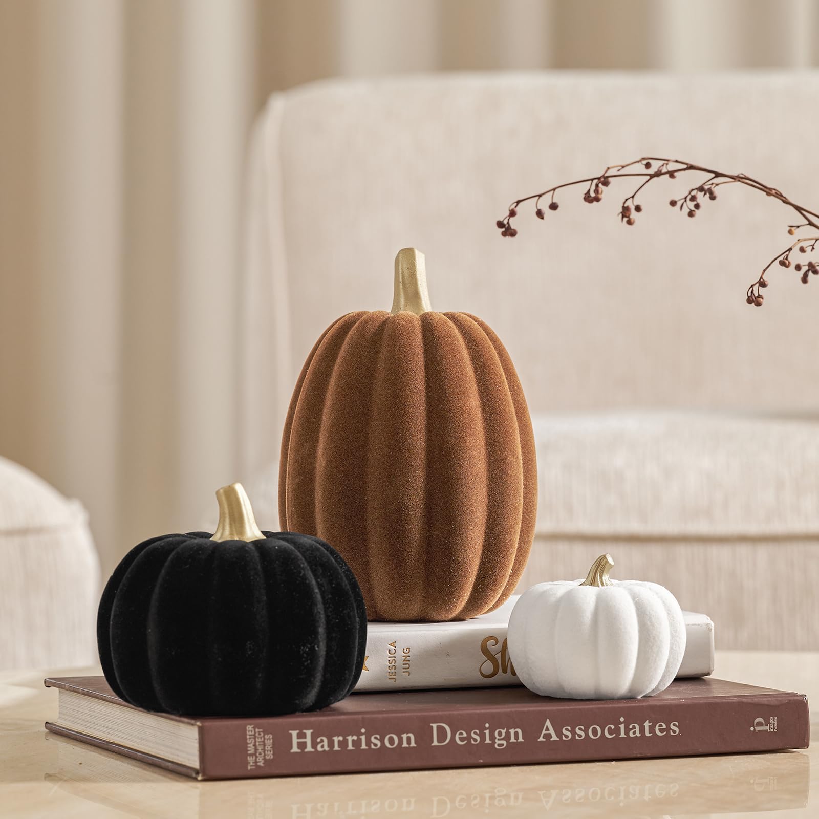
Image credit: us.amazon.com
It’s not fall decor without pumpkins, obviously. But how do you go beyond the standard, identical, perfectly round orange gourds that look like they just came off a factory line? The answer is variety, texture, and natural placement.
You need Heirloom pumpkins and gourds in your life. Forget the bright orange plastic items. When you shop at a farmer’s market or local stand, look for diverse shapes, warts, bumps, and colors: whites, pale blues, deep greens, and stripes. These natural differences introduce complexity and richness to your display.
When arranging them, don’t line them up like little soldiers. Group them in odd numbers—threes or fives—and layer them using different heights. Use a stack of old books as a pedestal for a small gourd, or nestle a large white Cinderella pumpkin next to a few tiny, bumpy gourds.
To pull the whole porch or entryway look together, try weaving a corn husks wreath for your door. It’s got that beautiful natural crunch and texture that contrasts nicely with the smoother gourds below it. This looks so much more thoughtful than something bright and synthetic.
Why You Need to Look Outside (Literally)

Image credit: www.renovationhusbands.com
If you’ve walked into a home where the fall decor feels instantly right, I can almost guarantee you that a good portion of it came from outside. Think about what makes the season beautiful: the changing leaves, the interesting bark, the pinecones, the acorns. These are all free, authentic, and inherently beautiful.
Gathering materials is part of the fun, actually. Head out for a walk and fill a basket with things like interestingly shaped branches, heavy pinecones, and even colorful leaves that you can press or gently spray with clear lacquer to help them hold their color a little longer. These simple elements bring the smell of earth and wood right into your living space—that sensory grounding is irreplaceable.
Look, I’ll be the first to admit—I used to be intimidated by decorating with natural elements because I worried they’d make my house look messy or dusty. I thought everything needed to be shiny and new. But the reality is, nature provides the most authentic texture and color palette for autumn, and it costs nothing.
A stunning centerpiece doesn’t require expensive imported goods; it just needs a large glass vase filled with gathered branches and perhaps some deep red hypericum berries. It’s simple, striking, and absolutely perfect.
When you use real elements, you’re nodding to the history of the season—the harvest, the preparations for winter, the natural cycle. It adds a layer of depth that plastic decorations just can’t replicate. If you want to dive deeper into the historical roots of using natural, locally sourced items for seasonal decoration, there’s fascinating information available on the cultural importance of the harvest season that helps shape our aesthetic choices today. It gives your decor an actual story.
Ditch the plastic spiders and embrace the beauty right outside your front door.
Bringing It All Together: The Cohesive Collection

Image credit: allamericanoutdoorliving.com
So, we’ve talked about swapping textures, ditching the garish colors, warming up the light with LED flicker candles, and getting serious about our gourds. The final piece of the puzzle is cohesion. Your fall decor shouldn’t look like a bunch of individual projects scattered around the house.
To make it feel cohesive, try to repeat elements. If you use metallic copper accents in the living room, bring a small copper container into the kitchen. If you use wheat sheaves in the entryway, bring a small bundled bunch of wheat to the bathroom counter. Repetition connects spaces and makes the entire home feel like it’s singing the same, cozy song.
Ultimately, the goal of fall decor isn’t just to signal a new season; it’s to make your home a retreat. It’s about pulling the comfort in, hunkering down, and enjoying the richness of the season. Focus on the senses—what you touch, what you see, and how the light makes you feel—and you’ll create a space you genuinely can’t wait to come home to.
What’s one texture or color you’re planning to introduce to your home this autumn to maximize that Hygge ambiance?

Leave a Reply